I change behavior for a living.
Outside organizations, that means brands and campaigns. Inside organizations, that means Loadmap. Either way, the test is the same: did people do the thing you absolutely needed them to do.
Work for
Proof that behavior moves.
Each of these got someone to do something they were not doing. Open any one for the full story, including why it worked.
Raising $2.5 Billion
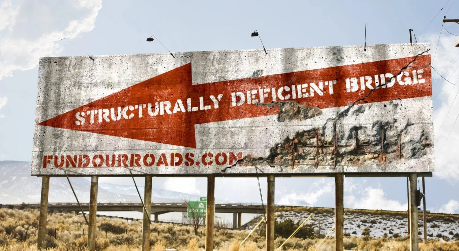
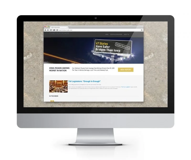
Iowa's gas tax hadn't moved in 25 years. A billboard designed for the holdouts' own districts never had to run.
Read the full story
The problem
Iowa had gone more than 25 years without raising its gas tax, and in that time one in five of the state's bridges had been rated structurally deficient. Five blue-ribbon panels studied the problem and recommended raising the tax, and all five recommendations were ignored. The governor and the statehouse had promised no new taxes, and nobody wanted to be the first to break that promise.
You can't shame a legislature into acting, and plenty of groups had tried. What you can do is change what inaction costs.
The work
We started with public data. The state publishes which bridges are structurally deficient, and billboard companies publish where their signs stand. Cross the two lists and you get something uncomfortable: for nearly every holdout legislator, there was rentable billboard space within sight of a failing bridge in their own district.
So we designed the billboard. A weathered red arrow pointing at the real bridge behind it. Structurally deficient bridge. FundOurRoads.com. Then came the part that mattered: we didn't run it. We showed the mock-up privately to the holdouts, along with the list of unsafe bridges in their districts. Party leaders called our client and asked that the signs never appear near their members, and the Iowa DOT worried the design was alarming enough to cause accidents. If a legislator moves before a sign ever goes up, the sign has done its work without ever being printed.
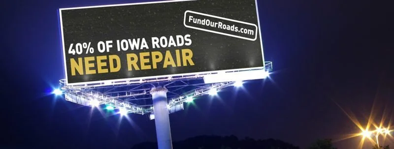
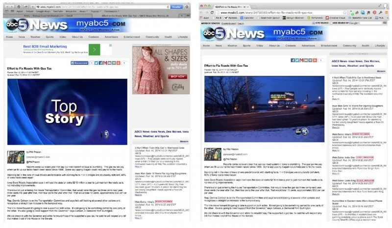
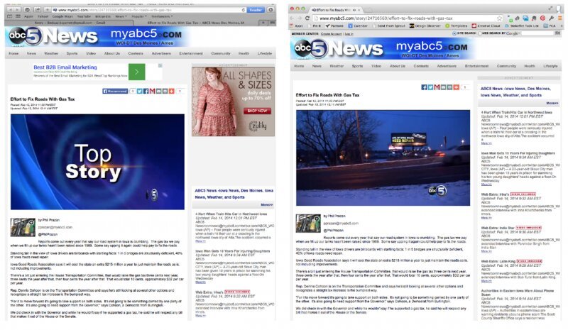
The public saw a different campaign. Milder boards ran in a handful of holdout districts and around the capitol. 1 in 5 bridges in Iowa is structurally deficient. 40% of Iowa roads need repair. 47 states have safer bridges than Iowa. Hard to argue with, and none of it burned a bridge with the people who had to vote.
Why it worked
The holdouts already believed the bridges were failing, and most said so, carefully, while voting for another study. What they had not done was act. The billboard threatened to put that gap on display next to the evidence, in front of their own voters. When what someone believes, says, and does stop lining up, they fix whichever is cheapest to fix. A yes vote turned out to be cheaper than a summer under that sign. Three months after the milder campaign made front-page news, the legislature raised the gas tax by 50 percent.



Branding both sides
DARPA is a shield to one audience and a threat to another. One mark carries both readings, shifting with the ground it sits on.
Read the full story
The problem
The Director wanted a mark nobody would notice. It had to look like it had always existed, as if the agency had simply forgotten to have a logo until now and someone found it in a drawer. That was the easy half of the brief.
The hard half: DARPA is two organizations at once. To the country it protects, it's a research agency, patient and quiet. To an adversary, it's the reason your best-laid plans stop working. Both readings are true, and the people inside the agency know it. A mark that showed only the friendly half would have been a small lie on every document the agency prints.
The work
One logo, built around a gradient that fades to deep black inside the letters. On a light background it reads calm, the agency at peace in its protective role. Put the same mark on dark and it turns ominous, the agency as an adversary sees it. Nothing changes but the ground it sits on. There's a four-minute video that shows both readings in motion.
Why it worked
Most rebrands fail the same way: the organization picks the flattering half of its truth, and then daily reality spends years contradicting the logo. The people inside know what the place actually is, and a mark that disagrees with them never settles in. This one held both truths at once, so there was nothing for reality to contradict. Nobody inside had to pretend, and that's why it looked like it had always existed.
Growing bambooHR's business
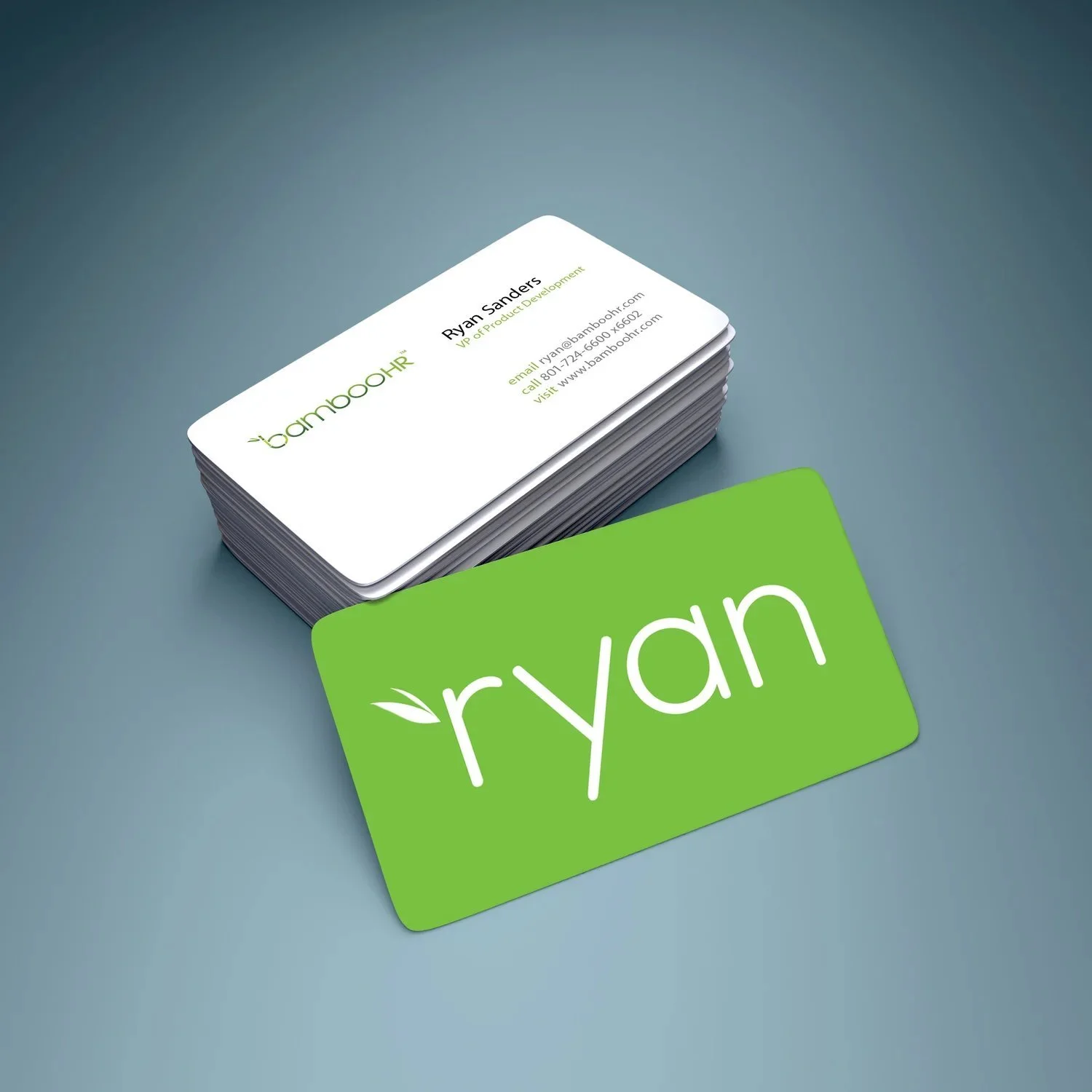
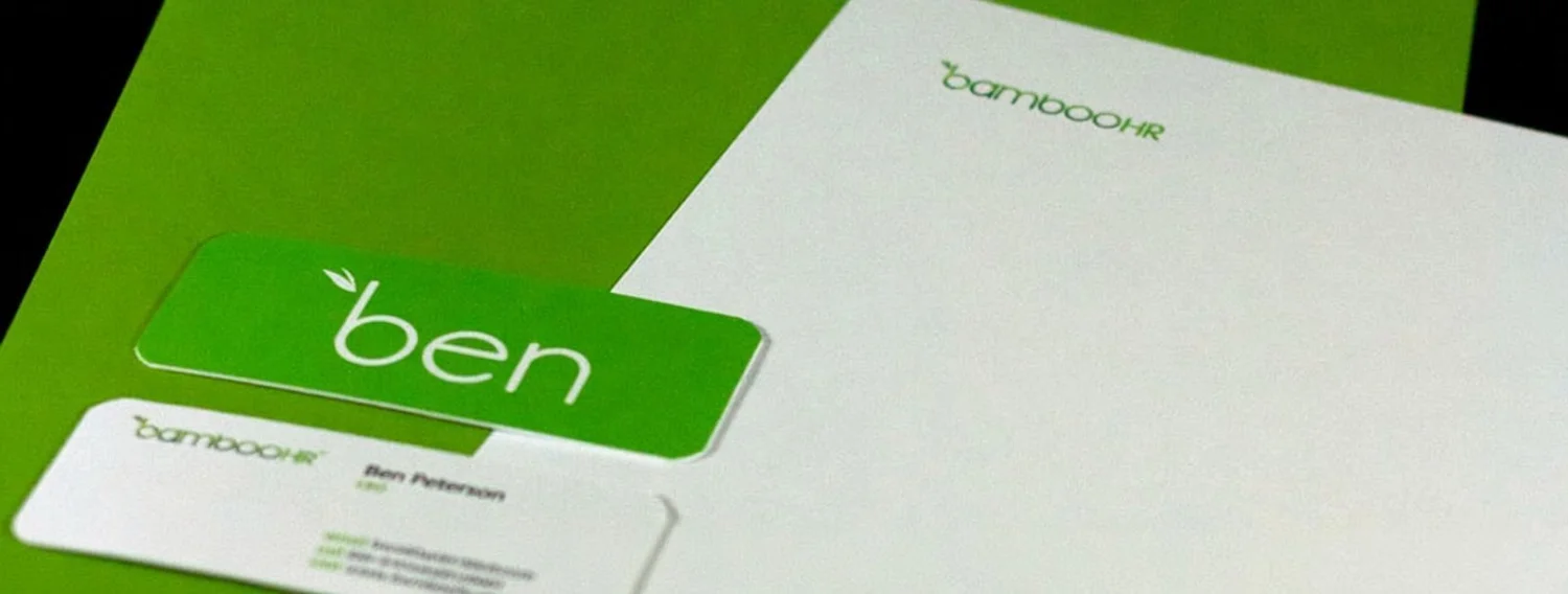
A business card with the rep's first name set bigger than the logo, and a story buyers retold at their own offices.
Read the full story
The problem
The company was easy to forget. Prospects met the sales team at a conference, liked them fine, and couldn't recall who they were a day later. HR software is a crowded room, and everyone in it says people matter.
The work
I put a question to the leadership team: what's the one thing an HR executive must know to be seen as good at the job by their own staff? The answer we agreed on was the name of the employee walking through the door.
So the card carried the rep's first name, set large. Bigger than the title, bigger than the logo. The card was only the prop. The real tool was the short story behind it, and I coached the executives to hand the card over name-up, let it sit, and never push. Prospects almost always asked about it, which was the invitation to tell the story with some weight behind it. Then the story did the selling. Prospects carried it back to their own offices and repeated it while making the case to buy.
Why it worked
Every HR company claims people come first. A claim costs nothing, so buyers discount it to zero. A company that prints its own rep's name bigger than its own logo is doing the thing it says it believes, in the buyer's hand, before anyone asks for trust. The object behaves the way the promise says, so the promise never has to be argued. And a story a buyer retells is a sale the buyer closes for you.
Changing 750K lives
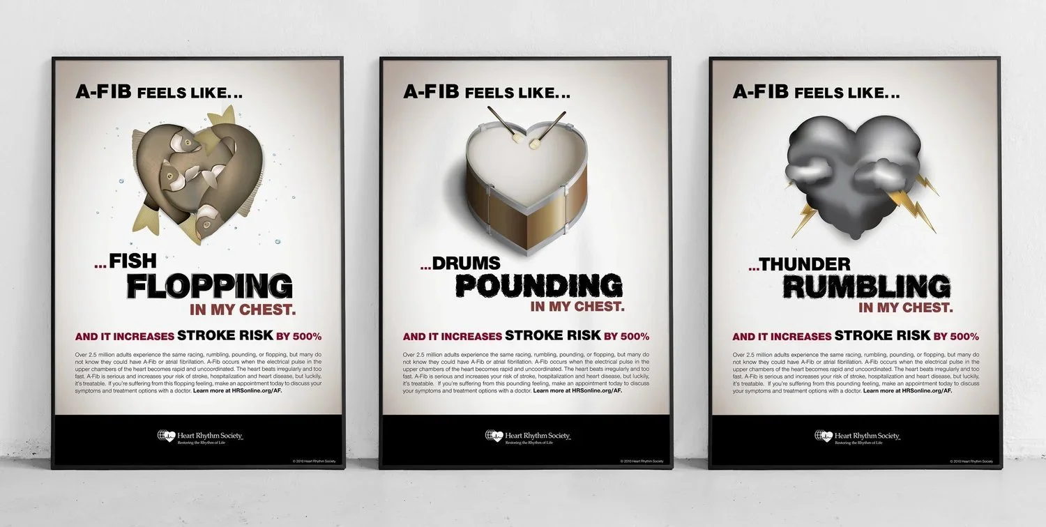
A-Fib was invisible because patients had no words for it. The campaign borrowed theirs: a fish flopping, drums pounding.
Read the full story
The problem
When we built this campaign, atrial fibrillation was barely known outside cardiology. A racing heartbeat got blamed on age or coffee, the standard test often came back clean, and untreated A-Fib raises stroke risk fivefold. Patients could feel that something was wrong. What they didn't have was a way to say it, and a symptom you can't describe is a symptom you don't mention.
The work
I gathered the most vivid descriptions real patients used and built the campaign from their words instead of the medical ones. A fish flopping in my chest. Drums pounding. Thunder rumbling. It ran as video, Times Square billboards, direct mail, and waiting-room posters, aimed at the two rooms where the conversation could actually happen: the waiting room and the exam room.
Why it worked
People don't act on sensations. They act on names. The medical term had been available the whole time and moved nobody, because it describes the heart and not the experience. A fish flopping in your chest is instant recognition: that's mine, and now it's a question I can ask a doctor. By the mid-2010s more than 33 million people worldwide were estimated to have A-Fib, most without a name for it. This was early work in giving the condition a public vocabulary.
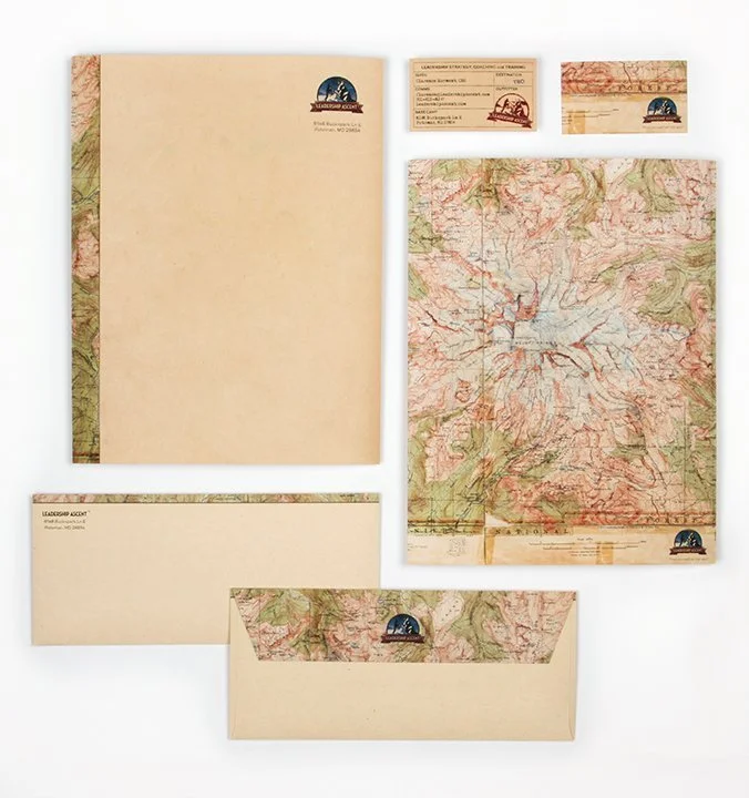
Making a leader's life matter
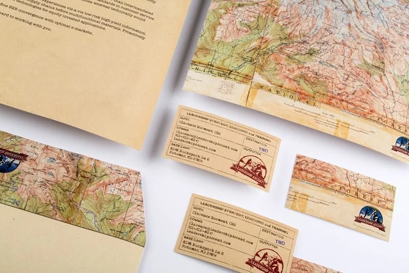
An identity built from expedition maps instead of coaching language. The card and letter do the selling.
Read the full story
The problem
The founder is a former Fortune 500 executive who tested his leadership lessons on the sides of actual mountains. The brief asked for a brand that filtered for the right clients, executives serious enough to do hard work on themselves.
The work
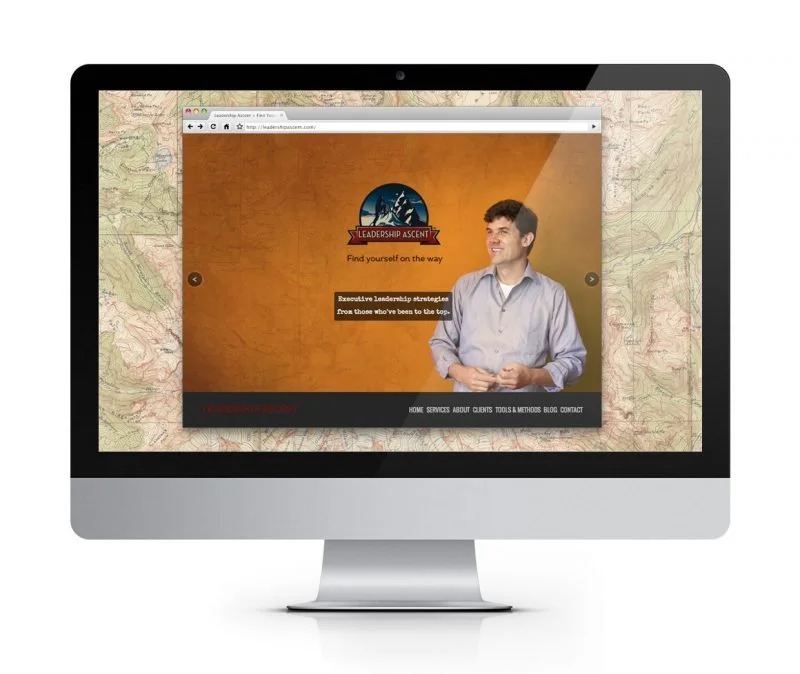
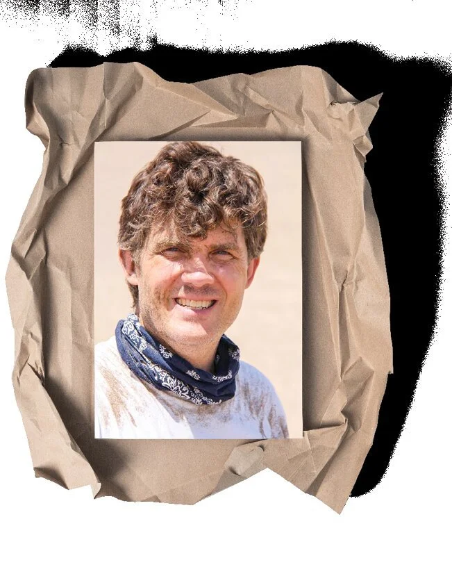
I set a quieter goal I kept to myself: make him look so capable that prospects change their behavior with no nudge from anyone. Name, tagline, identity, and photography all leaned into the expedition. Topographic maps run through the stationery. The photography is him on the mountain, not him at a whiteboard. The card and the letter now do the selling.
Why it worked
Coaching brands describe transformation, and every competitor's site uses the same two hundred words to do it. This identity skips the description and hands over evidence. A man who has carried his method up a mountain doesn't need to say he's rigorous. The materials also do the filtering the brief asked for, because a prospect who looks at that map and feels tired was never the right client. Self-selection is behavior change with the persuasion built in, and it filled the practice without a single ad.

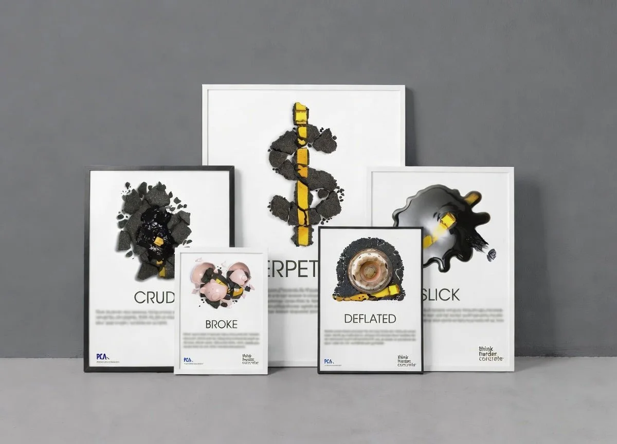
Think harder. Concrete.
The first time the concrete industry took on the market leader in paving. Research-backed ads aimed at the specifier's desk.
Read the full story
The problem
Government specifiers pick asphalt over concrete mostly out of habit, judging on upfront cost and speed. That ignores how concrete lasts longer, costs less over a road's life, improves gas mileage, and skips the refinery entirely. Nobody had ever made that case to the people who sign the orders. This was the first time the concrete industry directly took on the market leader in paving.
The work
A series of ads, one issue at a time, each pairing a sharp image and headline with peer-reviewed research. CRUDE. BROKE. PERPETUAL. DEFLATED. SLICK. Print, billboards, and web, all aimed at the specifier's desk rather than the public's heart.
Why it worked
The goal was to change what the decision runs on, not how anyone feels. Feelings reset by Monday. A decision input, once replaced, stays replaced, and research sitting where an assumption used to sit keeps working every time the choice comes up. The industry named it Best Overall, and the campaign immediately preceded the first significant sales uptick since the interstate highway system was built.
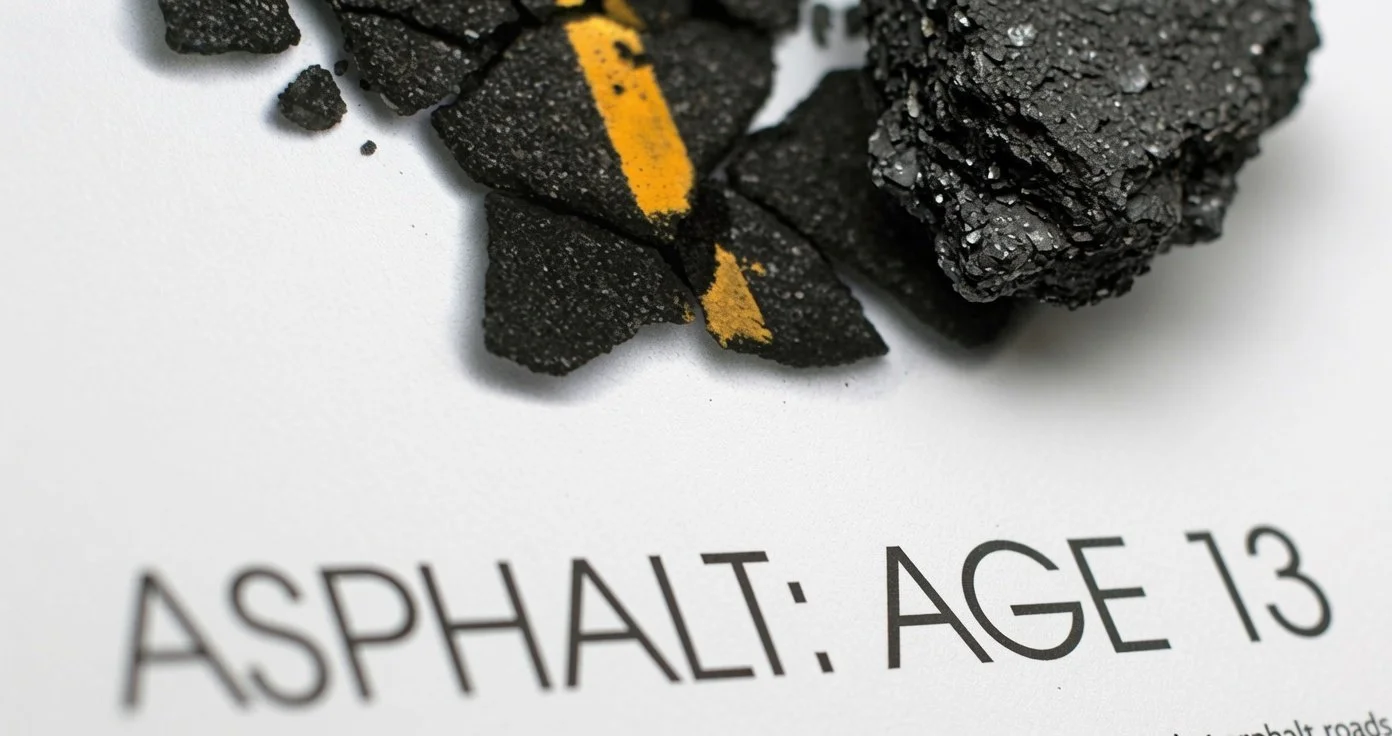
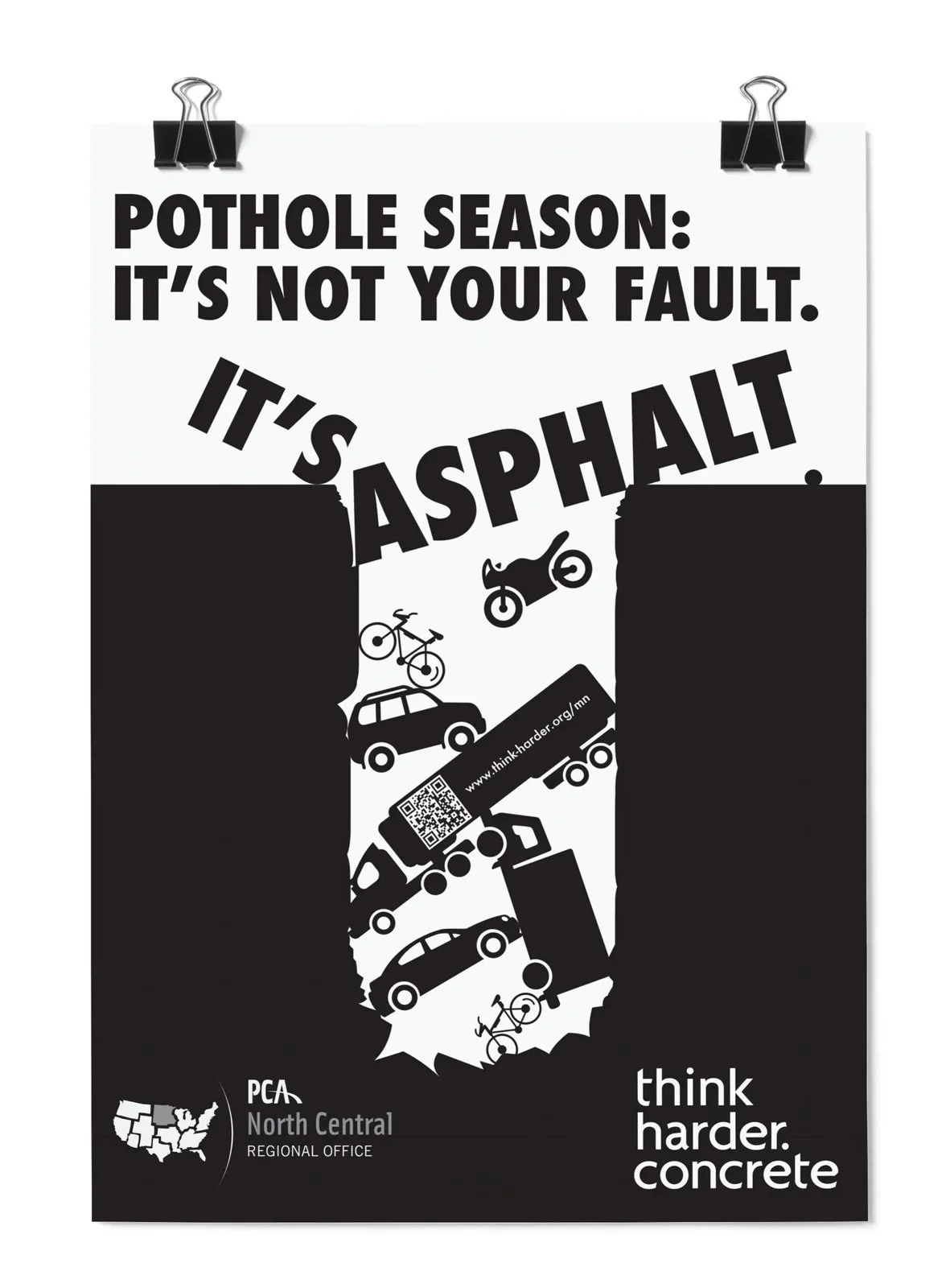
Pothole season
Drivers already hated potholes. The campaign gave the anger an address: it's not your fault. It's asphalt.
Read the full story
The problem
Drivers hate pothole season and have no idea the potholes are optional. The frustration was already out there, fully formed, aimed at nothing in particular. It just had no address.
The work
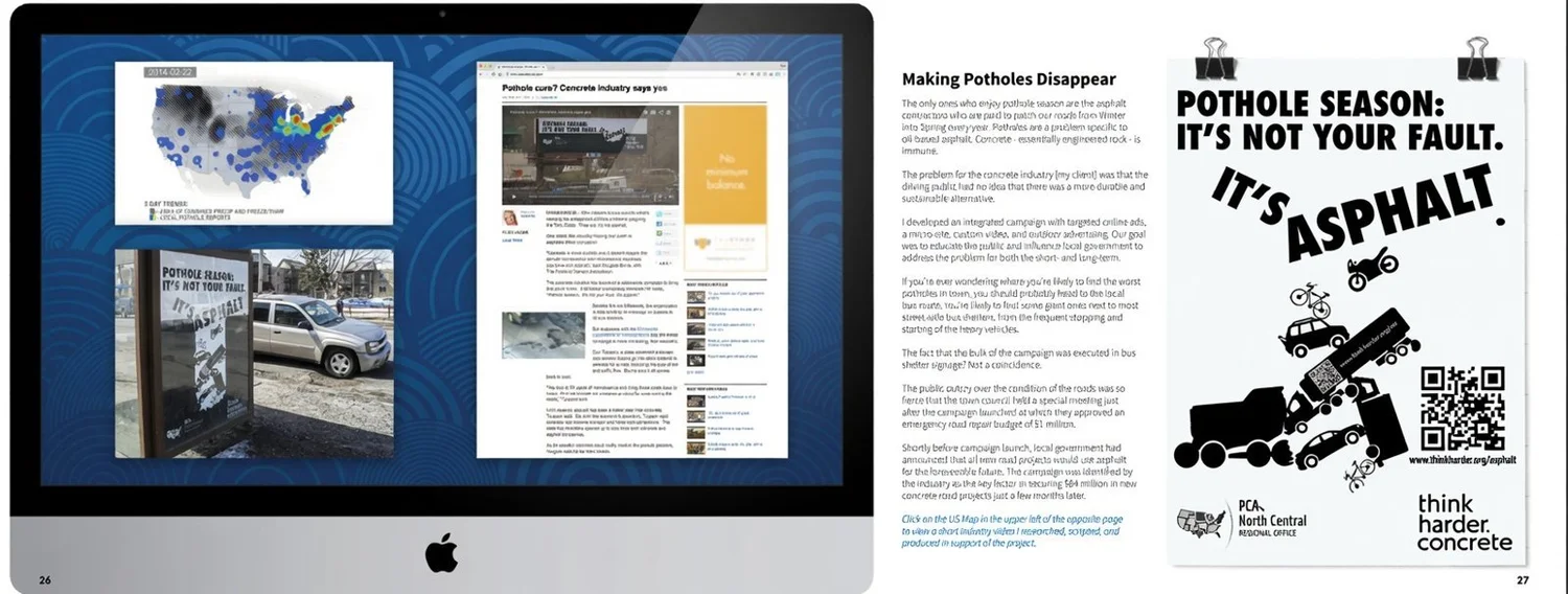
Pothole season: it's not your fault. It's asphalt. The campaign ran online, on a micro-site, in custom video, and on bus shelters, placed exactly where stop-and-start traffic tears pavement apart, so the evidence sat next to the ad. It made concrete front-page news and earned coverage from public radio and CBS.
Why it worked
The campaign didn't have to create anger, which is expensive. It relocated anger that already existed, which is cheap, by naming a culprit nobody had thought to blame. Once the frustration had an address, it turned into pressure on the people who choose road materials. One town council held a special meeting right after launch and approved an emergency million-dollar repair budget. The industry later credited the campaign with $64 million in new concrete projects.
One hundred years of concrete
A centennial built around members, not the association. Concrete makes good heavens, touchdowns, grades, mornings.
Read the full story
The dare that started it
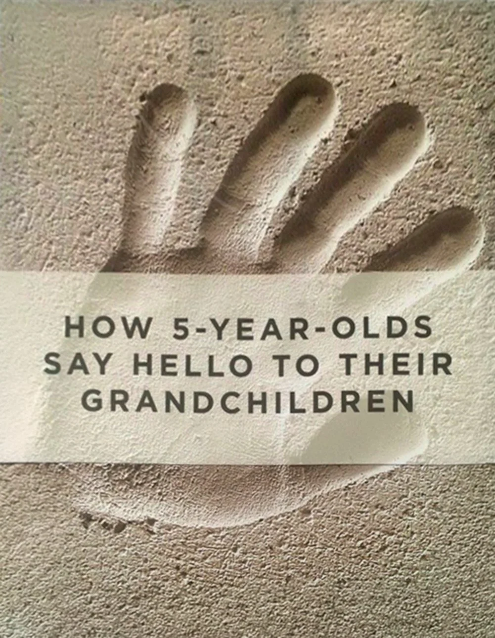
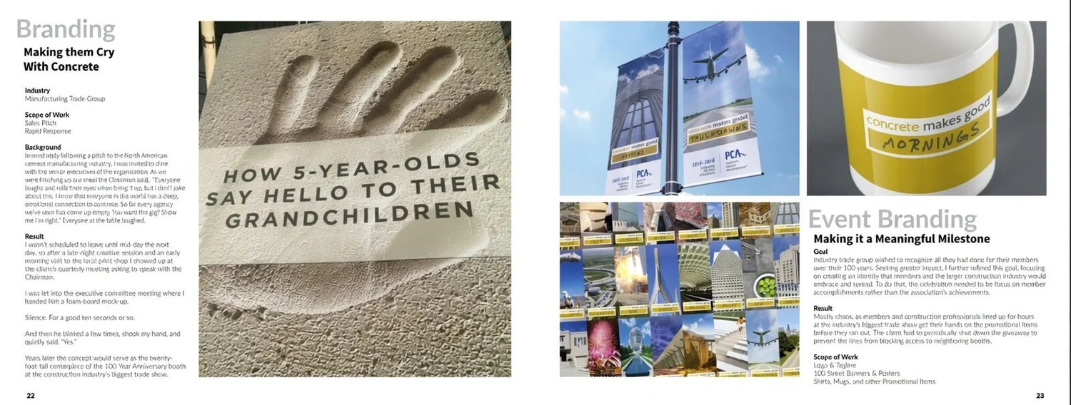
The account began with a pitch about handprints. Every family has one somewhere: a small hand pressed into a sidewalk, dated, permanent. We called it how 5-year-olds say hello to their grandchildren, and it won the account on the spot. For the 1916 to 2016 centennial, that same idea came back twenty feet tall as the centerpiece of the industry's biggest trade show booth.
The work
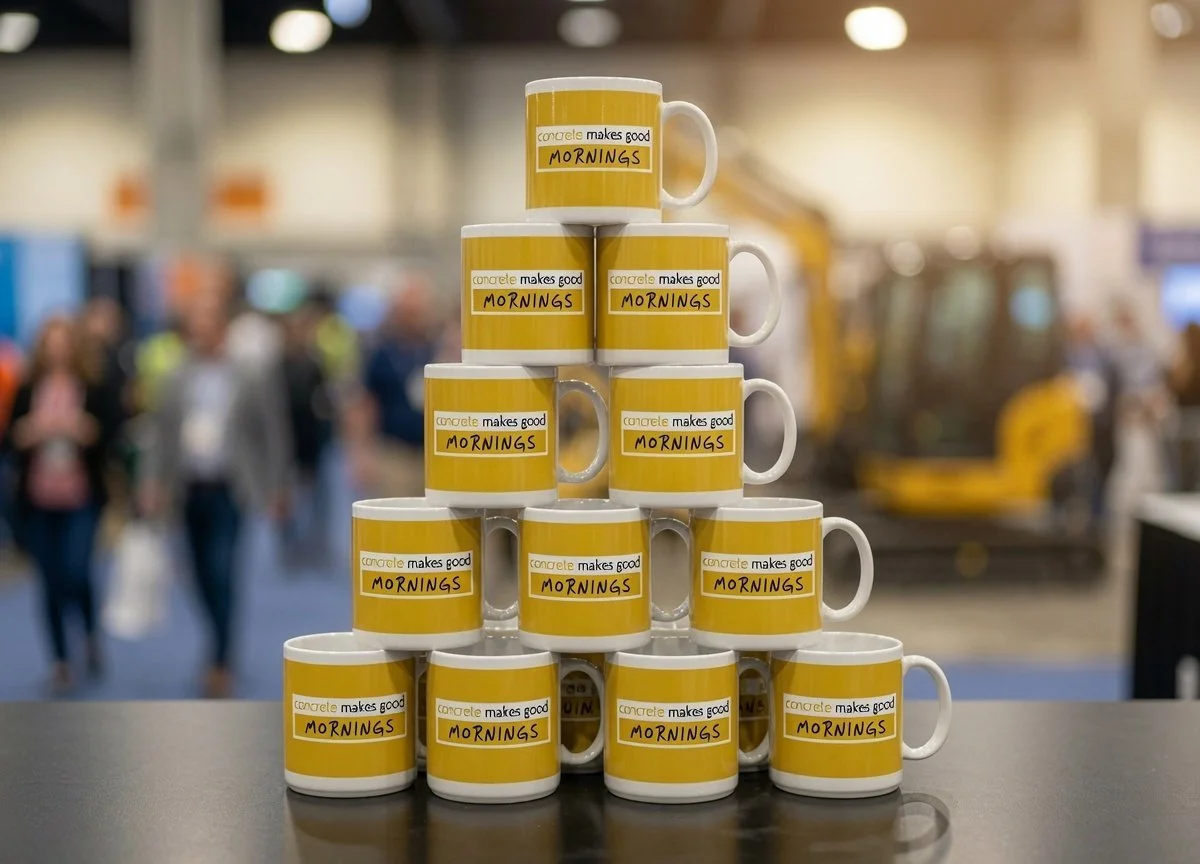
The centennial identity was built around members instead of the association. A fill-in-the-blank system: concrete makes good heavens, good touchdowns, good grades, good mornings. A hundred street banners, posters, shirts, and mugs carried it.
Why it worked
Anniversaries fail when they celebrate the institution, because nobody outside the building cares that an association turned one hundred. This one handed the celebration to the members, so every banner was about someone's actual work. Pride is a behavior engine: people line up for, wear, and keep things that say something true about them. The line at the booth was the proof: the client had to shut down the giveaway periodically to keep it from blocking neighboring booths.
Making sense, not noise
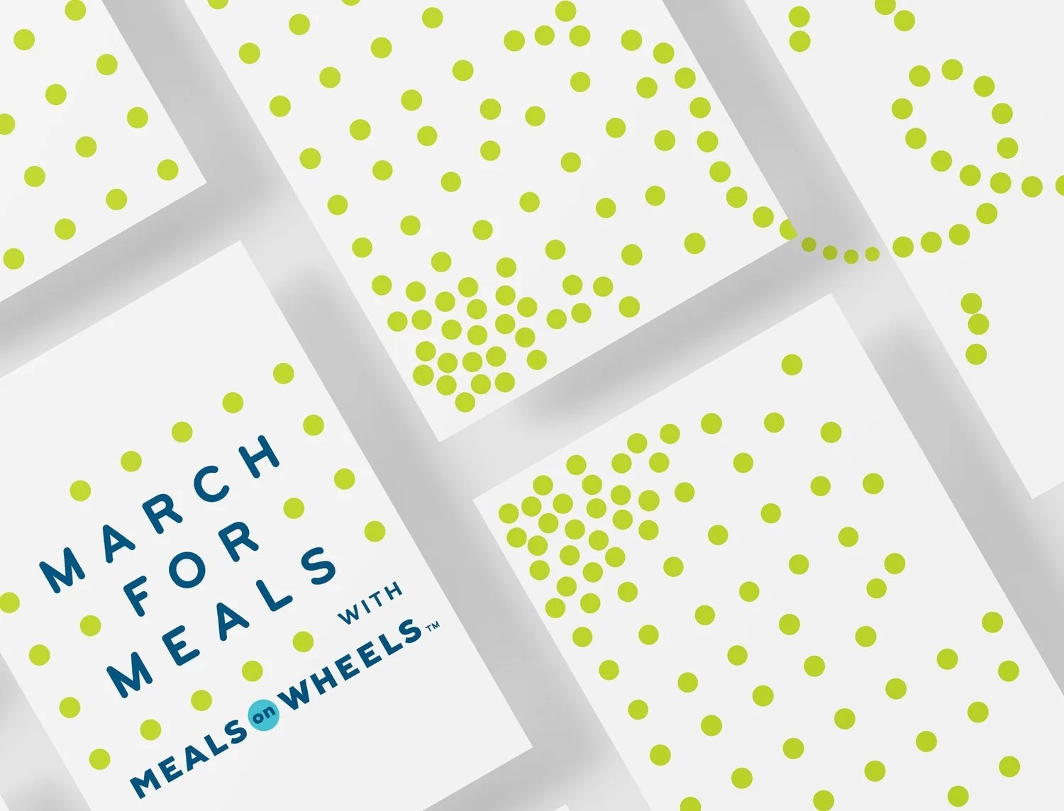
March for Meals had drifted from its parent. The rebuilt mark uses Meals on Wheels' own dots, one per day of March.
Read the full story
The problem
March for Meals was the largest fundraiser for thousands of local affiliates, and few people knew it belonged to Meals on Wheels, or what it even was. A rally? A parade? A walkathon? When givers can't tell who benefits, giving starts to feel like a risk, and interest was slipping year over year.
The work
I rebuilt the logo from the parent brand's own dots, so ownership is never in question. The dots double as marchers in print and in motion. And because there's one for each day of March, the mark also works as a countdown calendar for the fundraising month itself.
Why it worked
The fundraiser's problem was an attribution problem. Its identity had drifted far enough from the parent that every poster made someone ask who's behind this, and a question at the moment of giving is a donation lost. Building the child mark out of the parent's own visual DNA meant the answer traveled inside the logo, so the trust the parent spent decades earning flows to the fundraiser at a glance.
The better a campaign worked, the more it exposed the structure underneath.
Change what a market does, and the pressure lands inside the organization that has to deliver. Promise something the structure can't keep, and the promise itself does the damage. I watched that pattern for twenty years, one campaign at a time, until it stopped looking like coincidence.
So I built the tools that read the structure directly.
Loadmap
Every organization has a fix that didn't hold. The reorg bought a quiet quarter. The training helped until it didn't. The new values went up on the wall and the old behavior kept the corner office. When a fix snaps back, the problem was never where the fix was applied. Loadmap exists to find where it actually lives. The theory is mine, built over the same two decades as the campaigns above, and the campaigns are where it came from.
Find the layer that can't carry the load.
An organization is a bridge with five load-bearing layers. When a problem won't stay fixed, the break is almost never at the top. It sits in a layer below the behavior everyone can see, quietly feeding it.
How it works
Fixes get applied to the visible behavior because that's where the pain shows. Patch the symptom and the load runs straight back over the same broken layer, which is why the same problem returns wearing new clothes. The reorg, the training, and the poster all failed the same way: they repaired the deck of the bridge while the pier underneath kept sinking.
The Bridge locates which layer is actually failing, so the fix lands where the break is. That's the difference between fixing once and fixing annually.
Read the gap between what's said and done.
People inside an organization can feel when something is off long before anyone can prove it. The Lens makes the feeling measurable: it checks whether what an organization thinks, says, and does line up. Alignment is any two in agreement. Integrity, in the load-bearing sense, is all three at once.
How it works
When the three split, people feel the distance and the brand pays for it, inside and out. Staff read the gap between the values on the wall and the decisions in the room, and they recalibrate their own behavior to the decisions, never the wall.
Every campaign above is a Lens move run from the outside. Iowa made a say-do gap expensive. DARPA built a mark that couldn't contradict what its people believe. BambooHR printed its belief on a card. Loadmap runs the same three-way check from the inside, where the gaps start.
Sixteen ways an organization actually runs.
Advice fails when it's written for how the org chart says you run instead of how you actually run. A newsroom and an assembly line can have the same problem and need opposite fixes.
How it works
Loadmap reads how work actually moves and names the pattern. Sixteen recognizable patterns, sixty-four profiles underneath them. Yours might run like a newsroom, a pit crew, a test kitchen, a trauma team.
Once the pattern has a name, the recommendations can fit the organization that exists, and the name itself does quiet work: a leadership team that can say what they run like can finally argue about the right things.
Surveys in, written narrative out.
Short surveys go to staff and leaders, and the distance between their answers is itself data. The engine scores the organization on six axes, locates the strain on the Bridge, and names the archetype. What comes back is a written narrative for the people who have to act on it: where the structure is carrying more than it can hold, why the past fixes snapped back, and which moves fit the pattern you actually run.
Try the Load-Bearing Check
A short free scan that reads how your team actually runs and names the pattern. Five minutes, no email required for the quick path.
Run the free checkLoadmap, by Tate Linden. Offered exclusively by Stokefire.
The campaigns changed behavior by finding the real input a decision ran on. Loadmap finds the real layer a problem lives in. Same instinct, pointed inward, and the test hasn't changed: did people do the thing you absolutely needed them to do.
Trying to do something improbable?
That's exactly the kind of thing I want to hear about. Tell me what you're up against.
Email me