Making problems go away. Silently.
A rebrand for the nation’s top research agency, built to be powerfully felt but never noticed.
The old identity had been in use since the late 1950s. It was clunky on screen and read more like an 1960s airline logo than the most advanced research agency in the country. Employees were ashamed to wear it. The Director gave me two unusual rules. First, if anyone praised the new design, we had failed. It needed to feel like it had always been. The second rule? We needed to represent both sides of DARPA’s mission - preventing strategic surprise for America, and creating it for America’s adversaries.
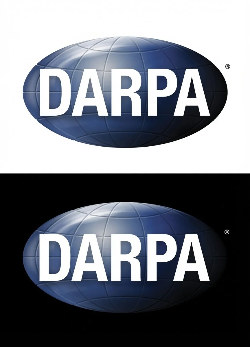
So I kept the basic shape and the blue, and rebuilt the mark underneath. A gradient lets it read calm and confident on white, then turn ominous on black. One logo, two moods, matching how allies and adversaries each see DARPA. Congress, which approves the agency’s budget, has never said a word about the change, which was the whole point.
Result
DARPA Director’s response: “I love it!”
Platinum MarCom award. Featured across major broadcast and cable news. Rolled out on a Section 508 compliant site of more than 10,000 pages. And the measure that actually mattered, set by the Director herself: praise counts as failure. Years of congressional silence, and employees wearing the logo again, meant it worked.
In other news, shortly after release the logo was placed on DARPA’s experimental vehicle, and flew at Mach 16 for six seconds. If a logo had gone faster than that in Earth’s atmosphere before then, I couldn’t find it. It’s the world’s fastest, until someone proves otherwise, I say.
Scope: Brand strategy, identity, web, communications.
Credits: Creative direction: Tate Linden. Design: Jonelly Sharp. Art direction: Kaitlyn Wells and Randy Rodriguez.
For context, here’s the logo we replaced: